How to Put Anime Characters in Your Pictures
Learn step-by-step how to place anime characters into your photos with realistic perspective, lighting, and edge blending. Source assets legally, master masking, color grading, and shadows for convincing composites.

By the end of this guide, you'll be able to place anime characters into your photos with convincing perspective and lighting. You'll learn to source assets legally, mask cleanly, match color, and add shadows for realism. The steps cover both desktop and mobile workflows, so you can practice on any device and publish fan art confidently.
Practical benefits of adding anime characters to photos
According to AniFanGuide, learning to place anime characters into your photos combines solid compositing with practice, not magic. This skill unlocks new storytelling possibilities for fan art, memes, and personal projects. In this section, we explore why creators love this technique and how it elevates simple portraits into cinematic scenes. You will discover core concepts like perspective, lighting, and edge refinement that create convincing blends. With patience, you can transform ordinary photos into engaging narratives that resonate with anime fans and art communities.
- Realism through perspective and lighting alignment
- Enhanced storytelling with character-context integration
- Flexible workflows across desktop and mobile devices
- Opportunities for fan art portfolios and social media engagement
Based on AniFanGuide analysis, adopting a deliberate workflow reduces guesswork and speeds up results over time.
Choosing character assets and licensing considerations
Choosing the right assets is as important as the edit itself. Start with character PNGs or vector illustrations that have transparent backgrounds so you can place them cleanly over the base photo. Always verify licensing: many anime characters are copyrighted, and using them for commercial purposes without permission can lead to issues. Based on AniFanGuide research, opt for assets labeled for fan art, publicly licensed images, or assets you own. If you plan to publish or sell the artwork, seek explicit permission or use original fan-created designs inspired by the character rather than direct copies. Keep a simple record of asset sources to avoid confusion later.
- Prefer PNGs with transparent backgrounds for clean edges
- Prefer assets with clear usage rights for your intended purpose
- Maintain a folder structure for base photos, character assets, and exports
Preparing your base photo: lighting, perspective, and cleaning
A convincing composite starts with a solid base photo. Ensure your image has good lighting, consistent shadows, and a clear horizon line if the scene contains a large outdoor backdrop. Check that the photo is high resolution (at least 2000–3000 pixels wide) so edges remain crisp after masking. Clean the image by removing distractions and correcting white balance before adding the character. If the background is busy, consider a simpler backdrop or a shallow depth‑of‑field look to help the character sit naturally in the scene. Remember, lighting direction should roughly match the character’s imagined light source to maintain realism.
- Use curves or levels to normalize exposure
- Lock color temperature to align with the character’s lighting
- Work on a copy layer to preserve the original photo
Core techniques: masking, perspective, and color matching
Masking is the heart of compositing. Start with a rough selection of the character, then refine with a feathered edge and a precise mask. Perspective matching requires adjusting scale and perspective to align with the base photo’s vanishing points. Color matching uses hue/saturation, color balance, and selective color adjustments to ensure the character doesn’t look out of place. A subtle color grade across the whole scene helps integrate the subject, creating a cohesive look rather than separate elements. Use adjustment layers to keep edits non-destructive and reversible. The goal is a seamless blend that feels intentional rather than pasted.
- Work with non-destructive adjustment layers
- Align scale with the scene’s perspective cues
- Apply a global color grade to unify tones
Blending edges and adding shadows for realism
Edges should look natural, not harsh. Use a soft brush on a mask to blend edges into the background, and apply slight blur if needed to mimic depth of field. Shadows anchor the character in the scene; create a new shadow layer beneath the character and paint with a low-opacity black brush, matching the light direction and distance. A subtle glow around the character can simulate ambient light interaction, but avoid overdoing it. For reflective surfaces or nearby objects, add faint color spill or bounce light to enhance realism. Regularly toggle the visibility of the base layers to ensure the composite remains convincing at different viewing scales.
- Paint gentle shadows that follow the light source
- Match shadow length to the scene’s depth
- Use ambient light hints for added realism
Workflow options: Photoshop, GIMP, Procreate, Canva
There are multiple paths to achieve the same result. Desktop workflows typically rely on layer masks, curves, and color grading. Photoshop offers advanced masking and blend modes, while GIMP provides a strong free alternative with similar tools. On iPad or Android, Procreate or an equivalent app can handle masking and painting efficiently, though some features may differ from desktop software. For quick, casual edits, Canva can be used for simple composition with ready-made templates, but it may lack advanced masking capabilities. Choose a workflow based on your comfort level, device availability, and the complexity of the scene. Practice with several methods to understand what works best for you.
- Start with a non-destructive workflow to preserve edits
- Save project files with layered formats (PSD/XCF) for future edits
- Practice across at least two tools to broaden your skills
Final polish, export, and ethics
Before exporting, review edge quality, color consistency, and shadow realism. Save a layered file so you can revisit and tweak any element later. Export in high resolution for print or sharing, and consider multiple formats (PNG for web, TIFF for archiving) depending on your use case. Ethically, remember to respect IP rights and avoid misrepresentation—clearly label fan art when necessary, refrain from implying official endorsement, and credit assets when required. The AniFanGuide team recommends documenting your sources and creating a personal best-practice file to reference on future projects.
Conclusion and next steps
The process of placing anime characters into photos blends artistic technique with practical editing skills. With careful planning, precise masking, perspective matching, and thoughtful color grading, you can create convincing composites that engage fans and showcase your growing expertise. The AniFanGuide team suggests continually challenging yourself with diverse scenes, experimenting with lighting moods, and sharing progress publicly to receive constructive feedback and accelerate learning. Consistent practice builds confidence and expands your creative toolkit.
Tools & Materials
- Photo editing software (e.g., Photoshop, GIMP, or a capable mobile app)(Supports layers, masks, and color adjustments)
- High-resolution base photo(At least 2000x1500 pixels; good lighting)
- Anime character asset (PNG with transparent background)(High quality, properly licensed or owned)
- Graphics tablet or stylus (optional)(Helpful for precise masking and painting)
- Color calibration reference (optional)(Keeps colors consistent across devices)
- Backup storage (external drive or cloud)(Back up originals and edits)
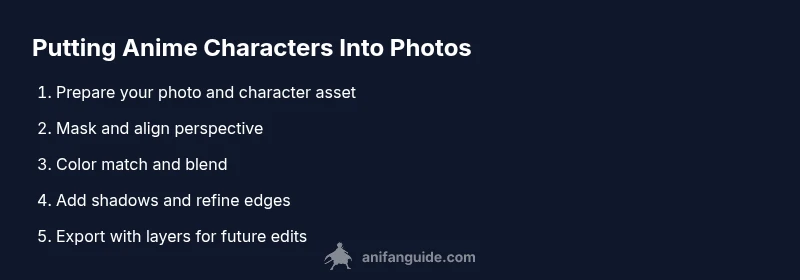
Steps
Estimated time: 90-120 minutes
- 1
Gather sources
Collect a high-quality base photo and a transparent anime character asset. Ensure licensing aligns with your intended use and organize assets in a dedicated project folder.
Tip: Use clearly lit photos and PNG assets for cleaner masking. - 2
Prepare character asset
Open the character PNG on a separate layer and resize while preserving aspect ratio. Check for any jagged edges and plan mask refinement before you begin.
Tip: Work on a duplicate layer to avoid destroying the original asset. - 3
Make a rough cut
Use a selection tool to create a rough mask around the character. Move quickly to establish placement, then zoom in for edge refinement.
Tip: Aim for a clean initial cut; you can always refine later. - 4
Match perspective
Scale the character to fit the scene and adjust perspective to align with the base photo’s vanishing points. Ensure feet and shoulders align with the horizon line.
Tip: Compare the character’s stance with shadows in the photo to avoid a floaty look. - 5
Color and lighting
Apply color adjustments (temperature, tint, and contrast) to the character so it blends with the scene. Use a global color grade to harmonize tones.
Tip: Use adjustment layers so you can tweak without destroying pixels. - 6
Edge refinement and masking
Refine the mask edges with a soft brush, feathering as needed. Remove halos by adjusting the edge and blending modes.
Tip: Keep the mask slightly wider than the visible edge to avoid hard seams. - 7
Add shadows and ambient light
Paint a shadow beneath the character on a new layer, match opacity and blur to the scene. Add a subtle bounce light if the background has strong illumination.
Tip: Shadows should be softer the farther they are from the character and darker near the contact points. - 8
Final adjustments and export
Review edges, colors, and shadows. Save a layered version for future edits, then export final images in appropriate formats (PNG for web, TIFF for print).
Tip: Always keep a PSD/XCF file with all layers intact.
Frequently Asked Questions
Is it legal to put anime characters in your photos?
Legality depends on asset licensing and intended use. For fan art, non-commercial projects with properly licensed or original assets are generally safer. Avoid implying official endorsement when distributing or selling.
Use licensed or original assets and avoid commercial use of characters without permission.
What software is best for this task?
Photoshop and GIMP are popular for their masking and color tools. Procreate and similar mobile apps work well for on‑the‑go edits, while Canva can handle simpler composites.
Choose a tool you are comfortable with that supports layers and masking.
Do you need advanced drawing skills?
You don't need to be an artist to start. Basic masking, perspective, and color adjustment skills will yield strong results. Practice will improve your precision over time.
No advanced drawing required; focus on masking and integration techniques.
Can I do this on a phone?
Yes, many mobile apps support masking and color adjustments, but they may be less powerful than desktop software. For complex composites, use a computer when possible.
Mobile apps work for simpler edits; for complex scenes, use desktop software.
How long does it take to learn?
Initial attempts can take 30–60 minutes per image. With practice, you’ll edit faster and produce more convincing composites in progressively less time.
Expect a learning curve; practice regularly to build speed and accuracy.
Where can I learn more advanced techniques?
Look for tutorials on masking, color grading, and perspective matching. Practice with different lighting setups and backgrounds to expand your versatility.
Seek tutorials that focus on masking, color grading, and perspective.
Watch Video
Main Points
- Plan composition and lighting before editing
- Mask edges precisely for natural blends
- Match perspective to create depth
- Add realistic shadows and subtle glow
- Respect IP rights and source assets legally